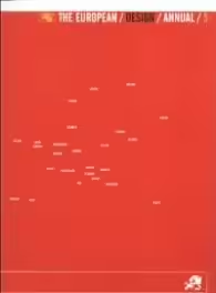
The European/ Design/ Annual/ 5

| Издателство: | Roto Vision |
| Брой страници: | 162 |
| Година на издаване: | 2004 |
| Дата на издаване: | 2004-12-01 |
| ISBN: | 2880464722 |
| SKU: | 38891380007 |
| Размери: | 30x23 |
| Тегло: | 1300 грама |
| Корици: | ТВЪРДИ |
| Цена: | 30 лв. |
Why does someone choose to become a designer? It's a question that kept nagging at my brain throughout our European Design Annual 2000 judging sessions. There are, of course, at least as many answers as there are designers, but wading through some of the entries in a competition makes you question people's motives when working. Why use the established graphic language of a particular sector or genre? Why produce an item that looks and feels like almost every other of its kind?
If the answer to such questions was simply "to make money" I would respect the responders' unfashionable but refreshing honesty. But I don't think the people who submit things to design annuals go to work just to earn money. If they did, the client's cheque would be reward enough, and they'd probably prefer to read their bank statements rather than this publication
No, issues such as a belief in the value of self-expression and a desire to make things better [in all sorts of ways] often inform the decision to enter an item into a competition. And yet, why does so much of the work sent in to design awards have the charisma of an ailing whelk and the inventive flair of a photo-copying machine?
Perhaps because the work entered can't help but reflect a wider malaise. There is something missing from most of the design produced today. The quality of the printing and paper and the professionalism of imagery and layout often mislead viewers into thinking they're experiencing something of substance when the reality is that most items are mere flimflam - the graphic result of a client uttering the words "I suppose we need some marketing" to a designer who doesn't really know why he or she is a designer.
This is a problem, for the client at least. We live in a world where the proliferation of messages and materials has reduced our desire to be communicated to per se while sharpening our appetite for individually excellent communications. This is, some say, an age of post-design, a time when what "we" in the design community are required to do is find or create or inspire real and valuable points of difference between our clients and somebody else's.
I'm not sure this is so very different from what great designers have always done; it's just that the need to do it has become even more urgent. That's why seeing such me-too or mediocre work is so puzzling - a failure to express real difference equals, in the world of communications at least, death.
Of course, trying to create difference is dangerous and difficult, but isn't that what makes being a designer interesting? In fact, apart from money, isn't it what makes designing meaningful? Fcr me, the highlights of the EDA have always been projects that risked something to gain something. Such as one of this year's entries - Thomas Richter Eigenhufe's limited-edition book exploring the micro-world found in a housing community, the Schloss Blankenburg. Here, the designer created the photographs, illustrations, writing, and design. He was closely involved with the printing, too. He probably even thought about trying to make the paper. The project is a fine example of a designer being totally engaged with a subject - there is both immersion and expression. What was the risk? Perhaps that no one would care a jot about the subject or what he'd done or that he wouldn't do his subject justice, I suppose he risked wasting his time. But he didn't waste his time; he created something truly exceptional.
There were memorable entries from many other quarters in this year's awards, but particularly from Sweden, Campaigns for Fisherman's Friend and Fender Guitars (both by Jerlov & Co. of Gothenburg) exemplified the rewards of letting personality shine through, while a brochure by Log [from Stockholm) for an insurance company was the very best of a large group of Swedish print entries displaying fresh and inventive art direction and imagery and a clear desire not to simply do what everyone else is doing.
Tim Rich
.
.